A smart e-commerce shop for physical and digital hiking products
Ecommerce
Smart Filters
Branding
AAL
Overview:
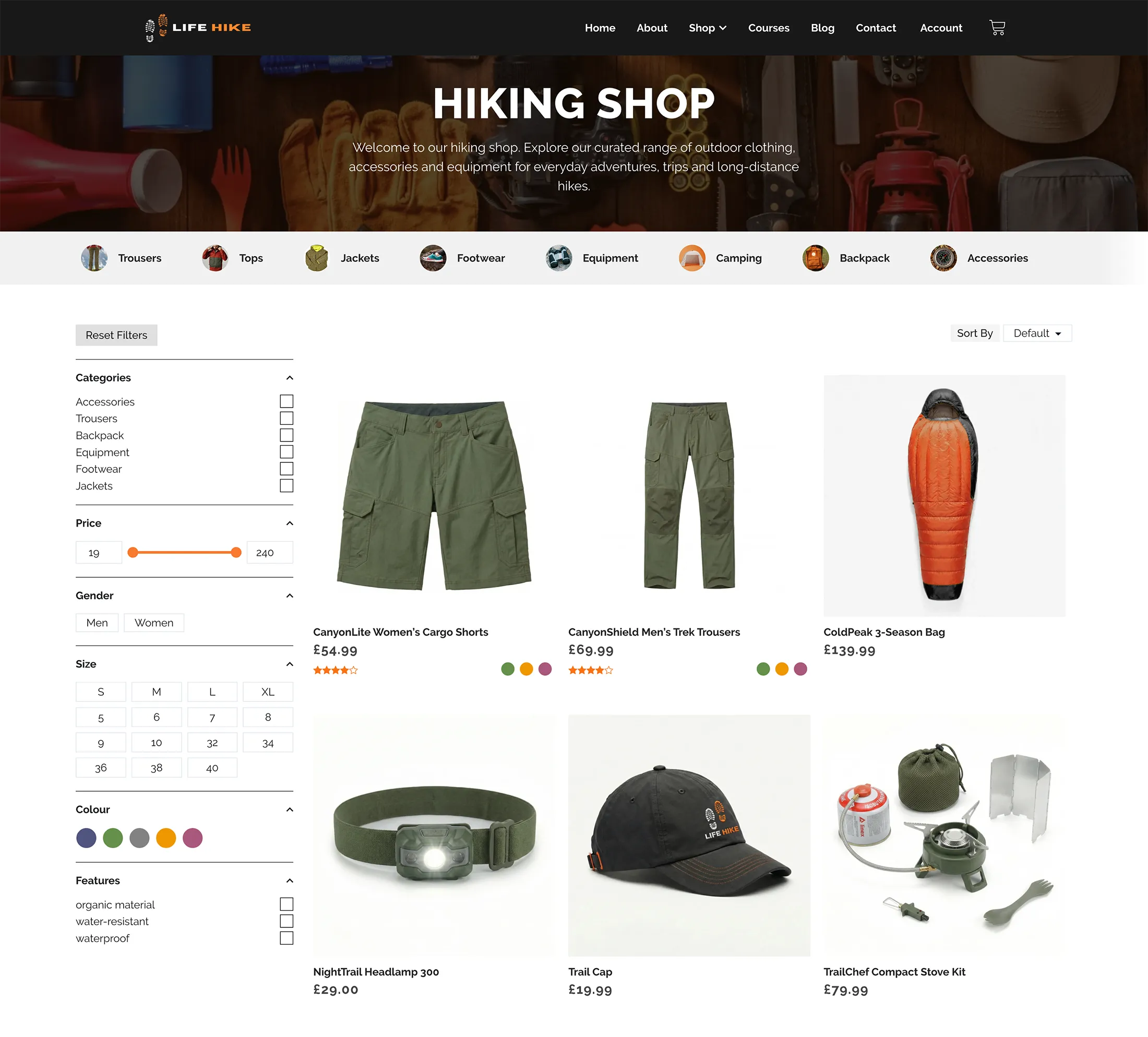
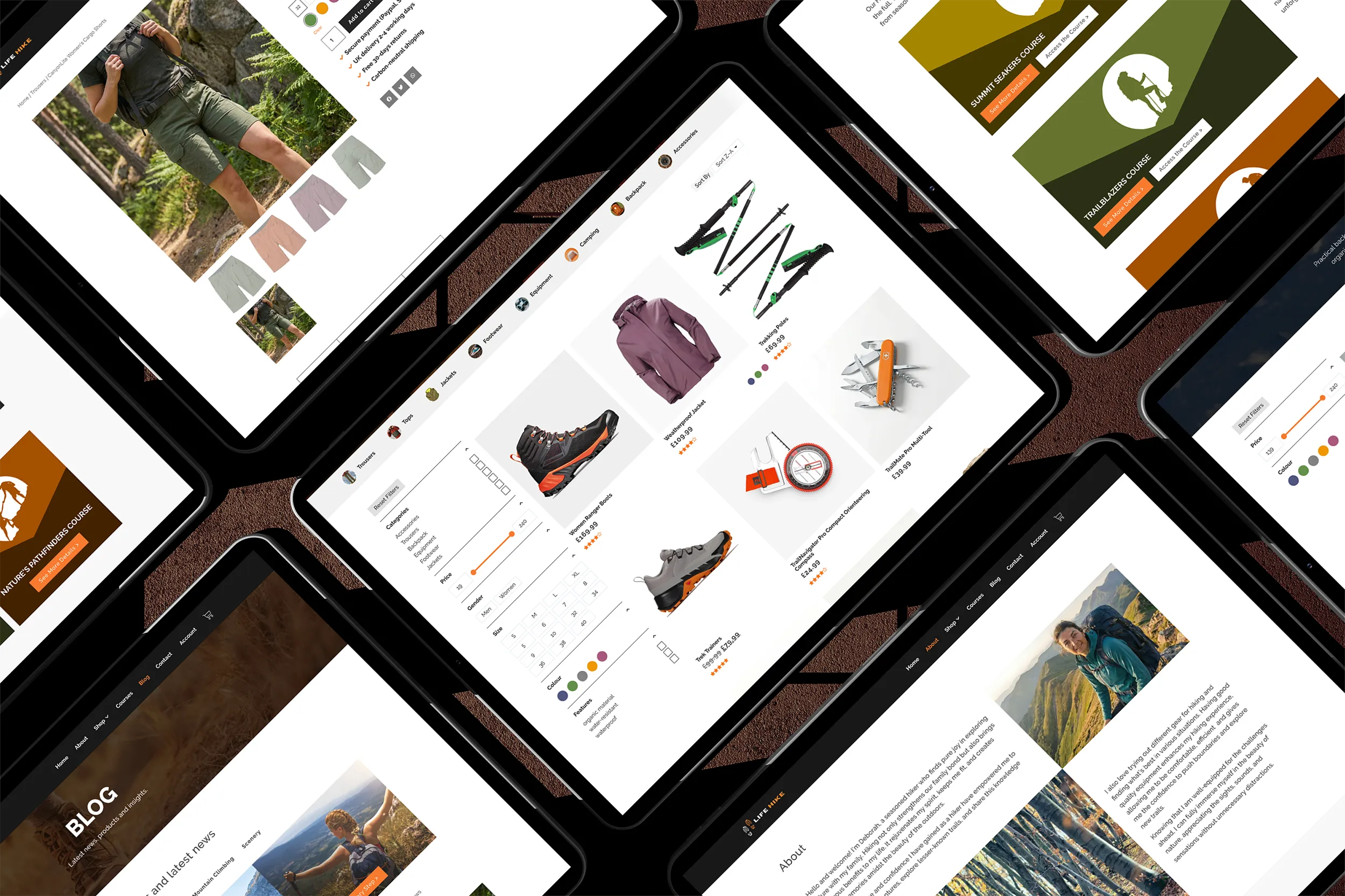
Life Hike is a modern outdoor e-commerce website designed around speed, clarity, and usability. We created a focused shopping experience with strong mobile performance, intuitive navigation, and an easy route from product discovery to checkout.
Highlights:
Online shop
Physical & digital products
Smart product filters
Clear navigation
Branding
Challenge:
Outdoor stores often have large catalogues, and customers need to narrow down options quickly. Part of the mission was to keep the shop feeling simple while still supporting detailed filtering across product attributes and features. Also, the site sells digital courses and needed a paywall and membershp access system.
The Solution:
we designed a structured category system and paired it with a custom filtering experience so shoppers can refine products by size, colour, gender and key features without friction. The build also supports physical products and digital downloads, including protected content behind a paywall, all within one consistent shopping journey.
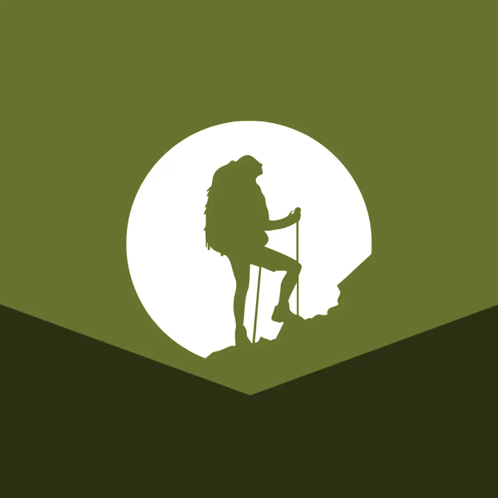
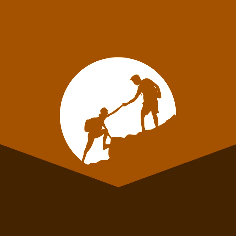
Alongside physical gear, Life Hike also offers digital courses for hikers who want skills, confidence, and routes they can follow. We built a simple course catalogue with clear CTAs and recognisable visuals so customers can choose a course quickly.
The Result:
The result is a polished, responsive shop that feels intuitive and is ready to scale. With a clean cart experience and clear steps from product to payment, browsing is quick, product discovery is smoother, and the site is set up to support both traditional e-commerce and digital product revenue in a single platform.
Branding & Digital Assets:
For Life Hike, we created a bold, outdoorsy brand that feels confident and practical. The logo pairs a clean wordmark with boot-print iconography to instantly signal hiking and trail gear, while the dark grey and orange palette keeps everything high-contrast and consistent across the site.
To support the digital side of the shop, we also designed a set of simple, punchy course illustrations using the same colour system and silhouette style, giving the courses their own recognisable look while still feeling part of the same brand.
Ready for a website you’re proud to share?
No pressure, just a friendly conversation to figure out what you need.