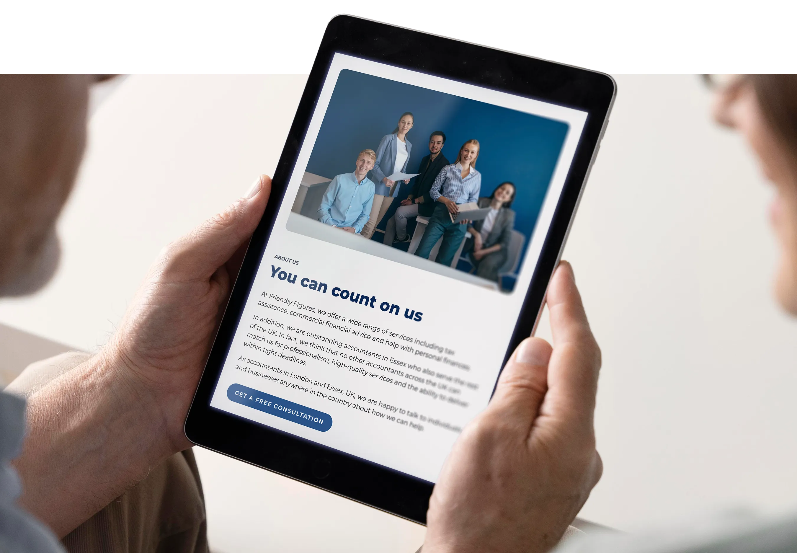
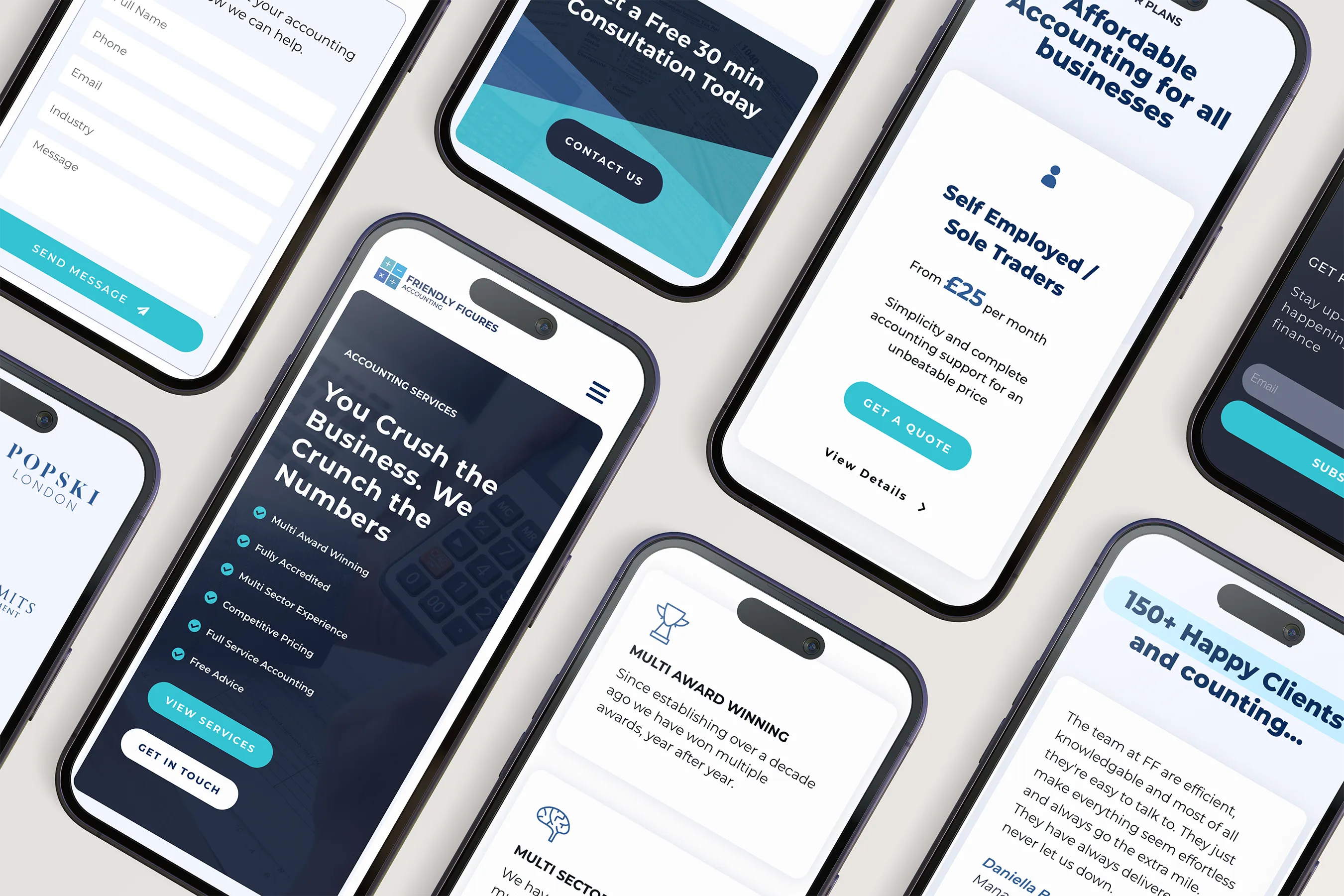
Friendly Figures is an accounting service aiming to remove the stress and confusion often associated with finances. They needed a modern website and refreshed brand that made accounting feel approachable, transparent and easy to act on. We redesigned their logo, visual identity and website to reflect a friendly and confident presence, while improving clarity and encouraging enquiries.
Highlights:
Brand Refresh
Trust signals
Strong CTAs
Challenge:
Accounting websites often feel heavy, technical or intimidating. Friendly Figures wanted the opposite. They needed a simple and welcoming digital presence that reassured potential clients, showcased expertise and made getting in touch feel effortless. The visual identity also needed to evolve without losing the original spirit of the brand.
The Solution:
We rebuilt the brand and website around clarity, friendliness and simplicity. Key information is structured into short, confident blocks with supporting icons for quick scanning. The blue palette provides familiarity and trust, while updated typography and spacing bring a modern feel. Calls to action are placed where it counts, including a quote request in the hero and a full contact form at the bottom, making conversion straightforward. Testimonials, service highlights and badges reinforce credibility throughout the page.
The Result:
The final website successfully balances professionalism with approachability. Visitors can instantly understand what Friendly Figures do, why they’re credible and how to get in touch. The brand now reflects the friendly ethos behind the name and supports more confident marketing going forward.
Logo & Branding:
We refined the Friendly Figures logo to lean into the approachable tone of the brand. The symbol uses basic mathematical signs arranged as tiles, which makes it playful without losing professionalism. We kept the established blue palette for continuity and credibility, but updated the tones and typography for a more contemporary look. The final identity feels friendly, grounded and trustworthy.
Ready for a website you’re proud to share?
No pressure, just a friendly conversation to figure out what you need.